Why Icons Are Essential for User Experience (UX) and How to Use Them?
Icons are an essential part of the graphics as they represent the clues to the deeper information. Such as the location icon represents the word locations and indicates you can view the address on Google Maps. Similarly, the telephone icon indicates the calling numbers.
The use of icons has become more common these days. It saves your space in the graphic and allows you to add more information without harming the core concept of the design.
High-quality icons serve the purpose of transcending the information from you to your customers. It is a channel that allows your readers to find the necessary information easily in a single image.
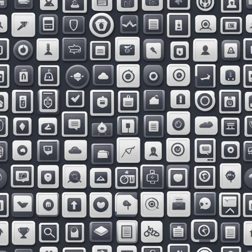
Additionally, the Icons play a critical role in convening the message to the customers. The phone number, locations, reviews rating icons and many more give depth to the message. The end user receives the required information easily which adds more clarity. Hence, when the customer reaches you to buy your services, he or she will have researched your company. The conversion rate of the business skyrockets and your business enjoys sustainable growth.
The Role of Icons in User Interface Design
Icons are considered universal symbols to convey the message. Have you seen the traffic lights and traffic rules symbols? These symbols are used in the majority of countries to maintain transportation systems. Similarly, the role of icons in user interface design also plays a critical role in explaining what the user can expect when clicking or viewing specific symbols.
Small visual symbols added to the graphic could explain the functions, features or content behind the symbols. It gives the interface a clean and neat structure making the design balance.
Symbols also promote minimalistic design concepts as more of the universal symbols such as setting icons, home icons, clocks, and email become popular among users. Users who have used digital tools are already aware of these symbols. Thus, you do not have to specify the content in the text. Users can move quickly in the interface using these common symbols.
Enhancing Navigation with Iconography
When it comes to saving the time of the users, the use of the icons in the interface would be a great choice. Especially the navigation bar could be converted from the text to the icons. It helps the users to simply browse the content looking at these icons and use them as a universal navigation system to move from one page to another.
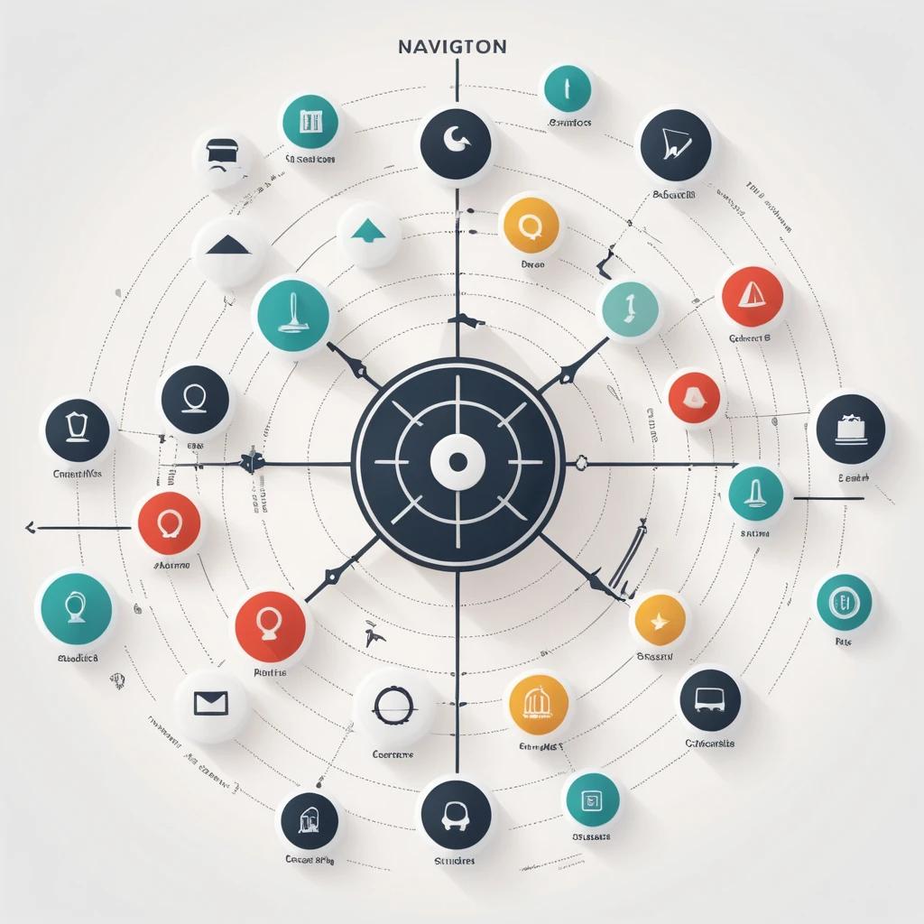
Icon providing immediate visual cues to the users save a good amount of time. Hence, people would find it more convenient to use the icons than spend time on textual content while performing navigation on the page. When the users can find what they quickly, it will enhance the usability of the system. Also, the system would enjoy aesthetic appeal making the design look trendy.
Why Icons Are Essential for User Experience (UX) and How to Use Them?
Improving Visual Hierarchy and Readability
Icons make the interface look more appealing. It would be more visually attractive and seamless at the same time. Visually hierarchy can be established and readability of the page content can be achieved with the use of simple-looking icons.
You can have these icons placed all over the webpage, interface, backend system and mobile-friendly interface. The design of all the platforms makes the users remember the particular information that they find interesting.
So the next time they visit back to the interface, they do not have to spend time reading and finding the information. Users will simply jump to the right page and get the required information. Hassle-free navigation promotes loyalty and more returning customers.
Providing Visual Cues and Feedback
Icon gives a visual cue to the users. When you see the specific universal icons in the interface of the website or the mobile application, you can presume where the page would lead you. The setting and telephone icons are the most used icons in digital content. A similar effect can be created with the other icons.
Icons that are made for prevention are mostly made of red color. So the users who see the icon in the interface know that they have to take caution when dealing with red icons. Green on the other hand is a sign of safety.
It indicates the safe zone or balance area, which leads you to the safe page. Clicking green icons would not harm your details.
Streamlining User Interactions with Icons
Making an interface user-friendly is a critical process in designing. The designer and UX experts have to put their thoughts into deciding what makes the users feel comfortable while browsing the content on your site. Every single user signing up on your platform is important, thus allowing the user to navigate to your interface smoothly is vital for the business.
The analytical experts and UX designers track the user’s interactions with the icons to understand how they are responding to them. The user should get what they are looking for easily unless they feel frustrated and never come back.
Especially, in the mobile interface where the attention span of the user is very low, the complicated structure may result in the user deleting the application to never come back again to your app. Hence, ensure you are using the right icons that represent the inside page content with accuracy.
Imagemo Studio will help you to find the right icon for your next project. Brose the thousands of high-quality icons for interface design and make your platform user-friendly.
Ensuring Icon Consistency Across Platforms
One of the important aspects of the use of icons is making sure the icons are consistent all across your platforms such as websites, mobile, social media pages and others. Create a close ecosystem where platforms look the same.
No matter what platform users try to access, they should find the information easily. Ensuring consistency makes the users feel at home and they do not get lost while browsing your digital platforms.
Using Icons to Simplify Complex Information
The primary purpose of the icons is to replace the complex text with visually appealing and easily understood symbols. The use of the symbols has been seen in history as well.
The ancient civilizations used to place symbols on the pyramids, and temples and day-to-day use stuff to tell other users about the message behind it. The ancient techniques are adopted in many industries to make the information transformation easy.
Symbols simplify complex information and make decision-making quicker. From traffic lights and safety measures in commercial buildings, everywhere you will find various kinds of symbols used to spread the message.
Choosing the Right Iconography Style for Your UX
Get the right iconography style independently designed only for your interface. Unique iconography gives a unique perspective to your content.
Also, the custom-made iconography style keeps your brand value high because they do not look copied from other brands.
Therefore, always design unique iconography that portrays your brand values.
Summary
Icons are an integral part of the user interface, therefore, put some effort into designing a beautiful-looking interface with creatively designed icons.
Follow the universal code while designing so the users viewing these icons find it easy to understand the message behind it. Visit Imagemo Studio to browse and download the latest icons on the web.


